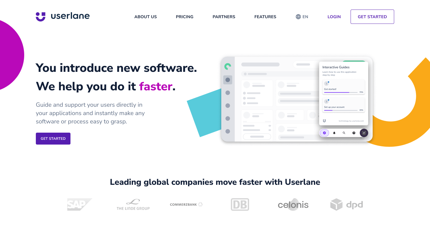
userlane brand refresh
Branding
At Userlane, I had the exciting opportunity to lead a brand refresh project. The goal was to create a brand identity that aligns with the company values, reflects the growth as a start-up to a scale-up, and is consistent across all platforms.

Together with the Brand & Content Manager we wanted to make sure that our brand was approachable, intuitive, and effective, values that guide our decision-making process and drive us to provide the best possible solutions for our customers. The new slogan "Make software simple" guided the creative process.
The three main brand colors were retained - purple, magenta, and yellow - to reinforce Userlane’s identity. Additionally, two accent colors were introduced, teal and green, to give the brand a fresher look and feel.

The colored floating shapes are deconstructed parts of the logo, that add playfulness and character to our visual language. I also created simplified icons that help to visualize ideas with a playful and colorful touch, connecting with the product where we use similar elements.
Concept for new company website
Concept for Linkedin posts promoting webinars
Concept for newsletters
view more projects